top of page

Lloyds Banking Group
Latest work
A brief overview of some publicly available work

During my time in the acquisition team of the Homes platform, I worked across various features. These include the mortgage/remortgage calculators, the agreement in principle where our customers receive a lending decision from us, the dashboard which is where users go to manage their application, and the mortgage application journey.
A list of some work I led experience design on:
-
Reducing the steps within the Agreement in Principle form
-
Pre-population of data within the Agreement in Principle
-
Automatic income verification within the Agreement in Principle
-
Open filters on calculators
-
Budgeting tools research
-
Help mode on the calculator
-
Monthly cost search toggle on calculator
-
Zoopla landing page research
-
Entry points in the journey to our third-party tool Planna to provide neighbourhood insights
-
Navigational overview screen of mortgage application steps
-
Appointment booking triage screens
-
Bringing Interactive XO (third application channel of choice) into the journey
-
Mortgage Readiness feature teams 2030 vision

CASE STUDY 1
Zoopla Landing page
Customers viewing properties on Zoopla can use our Lloyds affordability calculator to estimate how much they can likely borrow and what the monthly cost of the property might be. Zoopla traffic is one of our highest volume entry points into the mortgage journey, but we are unable to keep them.

Zoopla
Mortgage calculator
Lloyds
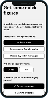
Intent screen
THE PROBLEM
Once users click the 'check eligibility' CTA on Zoopla, we would direct them into our Lloyds journey and land them immediately on our user intent screen to capture what the customer was looking to do.
This led to:
-
61% of users dropped out on our user intent screen
-
Just 1.5% of users progress to get an Agreement in principle (AIP) result
From alternative entry points in our mortgage journey, 75% of customers complete intent showing the notable drop-off on intent specifically coming from our Zoopla traffic.
HEARING FROM OUR USERS
Lack of trust
Participants described the current user flow from Zoopla into Lloyds as 'coldly passing from one brand to another'.
No personalised experience
Users coming from Zoopla explained how they could be at different stages in their home-buying journey and everyone is pushed from intent into the AIP in the current experience.
Expectation gap
They were expecting to see mortgage rates and felt the CTA wording did not align with where they were directed to.
Unaware of Lloyds offerings
As all users are funnelled into the same form, they don't get the opportunity to learn what tools and services we provide. Therefore, there's less motivation to proceed.
THE SOLUTION
We wanted to meet what our customer needs were by creating a new screen to direct our Zoopla traffic to. Our aim was to bridge the brand gap between Zoopla and Lloyds, promote mortgage rates which our customers are primarily interested in, provide multiple next steps to cater for all customer maturity levels within the home-buying journey.
We conducted two rounds of moderated user testing with a broad range of participants.
Some first-time buyers, some home movers, varying ages and stages within the home-buying journey.


" I'd be thinking of next steps and I'd already be thinking about do I want to do a quick survey to find mortgage rates or do I want to get an AIP? "
Participant 3 - Version 1 prototype
" I do like the fact that it's giving me this much detail "
Participant 5 - Version 2 prototype
Final research takeaways

Good brand exposure

Useful for early-stage researchers

Big engagement with rates
Now, we are currently A/B testing our final iteration
In one place, users can now:
Quickly check their affordability
View live Lloyds mortgage rates
Access supportive guidance from our site via the knowledge hub
Clear next steps and descriptions to move to an AIP, save progress in the dashboard or continue to our full calculator.
Experience a dual-branded journey for a more seamless transition from Zoopla to Lloyds


THE IMPACT
So far we've seen:
-
Although we saw a 26.9% decrease in users continuing to our dashboard directly from the landing page, we saw a 31.1% increase in these users continuing to start an AIP instead. This suggests customers were more confident in what their next step should be.
-
Of these users, there was a 41.1% increase in conversion of them continuing to get an AIP result.
CASE STUDY 2
Mortgage Product Cards
THE PROBLEM
Within our mortgage and remortgage calculator results screen, we previously displayed 30+ product cards to customers when exploring what rates and term lengths they could receive based on their search criteria.
This prevented customers from being able to quickly identify the right deals for them, led to endless scrolling and the cognitive overload on screen prompted customers to drop out of the journey without exploring the rest of our application journey.
-
ContentSquare data identified that less than 50% of users that see the first product card in our mortgage calculator then scroll far enough to even see the third product card.
-
Our competitors like Natwest and Nationwide were already making changes to condense the number of rate cards shown, reinforcing our need for a more condensed view on the calculator.
THE SOLUTION
Our aim was to improve user understanding of the product cards and make them easier to compare.
Therefore, we reduced unneccessary duplication by showing one product card per term length, adjusting how we show incentives and displayed all product fee options at once.

-
We cut down 2/3 of the product cards that we previously showed users.
-
We now show a maximum of 8 product cards without compromising on the information provided.
-
Now, we display the product fee options and show how that dynamically impacts the interest rates.
-
We also highlight which product fee option is most economical for a customer based on which deal they are looking at.
-
We stopped displaying Total Amount Payable (TAP), a long-term estimate based on assumptions about behaviour and interest rates far beyond the initial term which could mislead or deter users.
-
We replaced TAP with Total Cost of Deal which gives a clearer, more exact figure for what customers will pay only over their chosen product term. This better reflects today's priorities, where rising everyday costs mean customers are focused on short-term budgeting and monthly affordability.
We ran these changes iteratively as A/B tests to assess the impact of our changes to the product cards.

THE IMPACT
Through A/B testing, we identified that our new version of the product cards drove stronger early-stage engagement with our mortgage journey.
-
We saw an increase of 15% in customers who saw our new product cards in our Mortgage Calculator then continue on to start and complete an Agreement in Principle (AIP) which was our primary target metric.
-
For our Remortgage calculator, we saw an 8% increase in conversion of customers viewing the new product cards to then start an AIP.
-
We found about 40% of our users on the page engaged with the product fee radio buttons that we introduced. This shows initially strong engagement, but there is potentially more we could do to encourage further interaction with these options.
bottom of page